STEN & KANT
Culture built with clarity.


[ client ]Sten & Kant Architects
[ industry ]Architecture
[ scope ]Brand Identity, Art Direction
Sten & Kant is an architecture practice shaped around clear systems, material honesty, and lasting public spaces. The identity translates that rigor into a modular mark, a precise typographic voice, and a controlled visual language that feels structural without becoming cold.
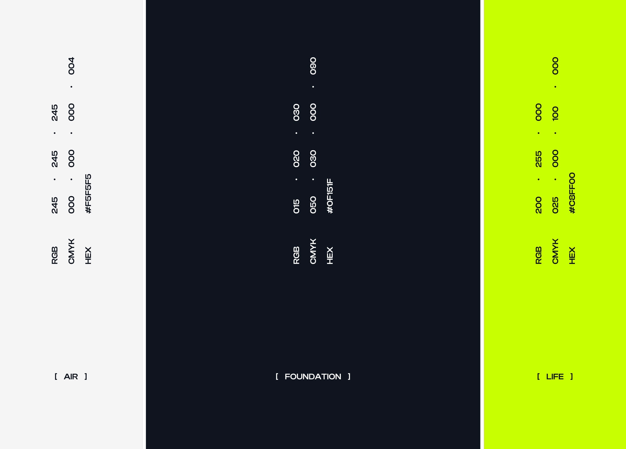
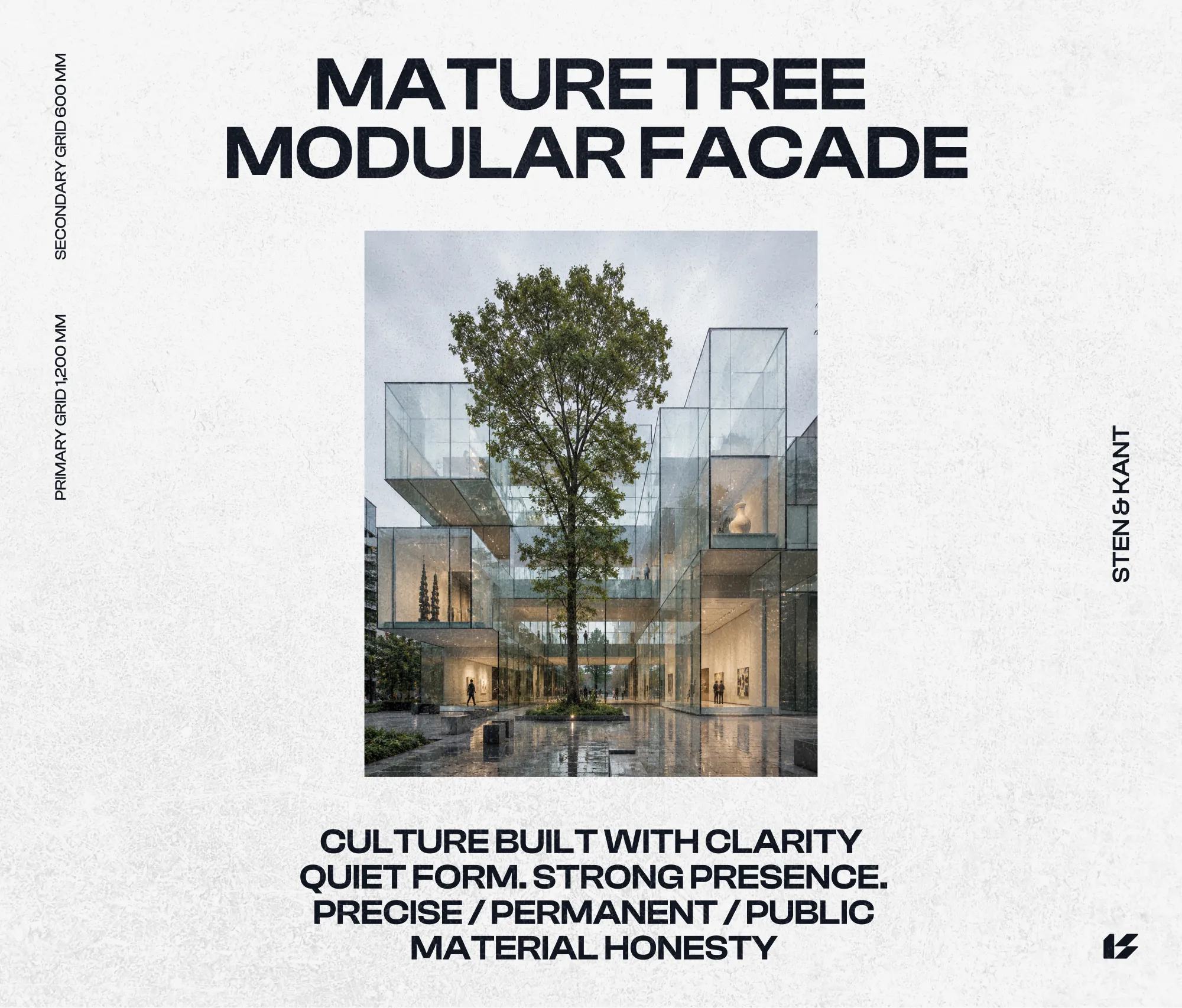
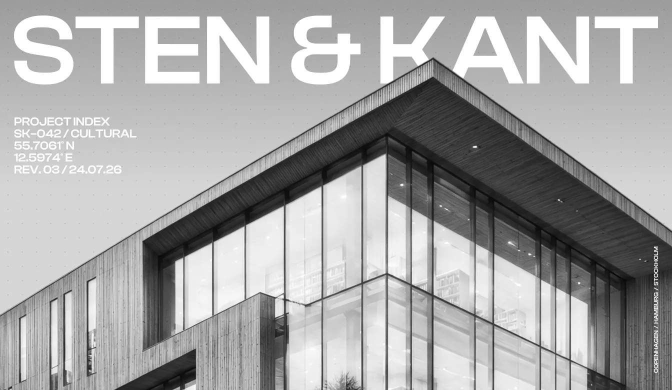
A restrained foundation of deep navy and off-white is sharpened by an electric green accent. Across project documents, digital interfaces, stationery, and presentation materials, the system gives technical information a confident rhythm while keeping the architecture at the center.

SENSES
Skin, in its softest state.